Page Elements
Everything you need to know about the new elements and page template is located on this page!
Page Elements
A variety of new page elements are now available with the new content template and can combined into numerous arrangements. Please email the Web Team to enable the new content template for any pages on your site.
Standard Elements
Basic content elements.
Media Elements
Elements that contain multimedia content (images or videos).
Advanced Layout Elements
Elements that have specific content requirements.
Optional Page Template Configurations
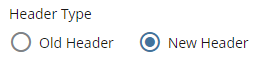
For the header, you now have several custom configuration options available. These options are available when clicking on the "New Header" option under "Header Type":
- Solid Color
- Right Image
- Full-width Image
- Tall Full-width Image
Solid Color
This option will have the header filled with our solid SCSU red color.
Right Image
This option will display an image that is positioned on the right side of the header. Recommended image dimensions: 800x600.
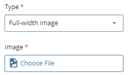
Full-width Image
This option will display an image that spans the entire width of the header. This is the option that we are using on this page. Recommended image dimensions: 1200x350.
Tall Full-width Image
This option will display a taller image that spans the entire width of the header (the page header will be larger in size). Recommended image dimensions: 1200x550.
With each option, you will have the option to add a custom overline. You will have 3 options:
- Site Title (inherits the title of the site)
- Custom (allows you to enter in custom text)
- None (if this is selected, no overline will display)
Also, you will have a field to enter in custom subtext (this is the last line of text that is displayed in the header).
To add an image, you will need to select either "Right Image", "Full-width Image", or "Tall Full-width Image". Once selected, a field titled "Image" will populate. Click on the "Choose File" button to locate the image:
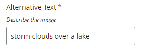
You will also need to provide an image description in the "Alternative Text" field:
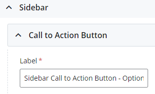
Appears in the left sidebar under the navigation links. Limited to three buttons.
- When editing the page, locate the "Sidebar" section.
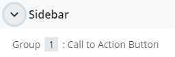
- Click into the "Group" section and add the label (this will be the text that populates on the button).
- Set the "Type" to be either "Internal", "External", or "None".
If "Internal", browse and select the internal page.
If "External", enter the external URL in the link field.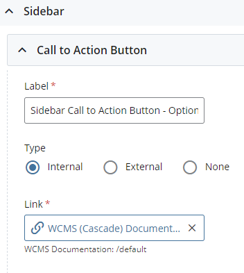
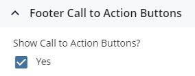
Appears at the bottom of the page when using the new content template. Limited to three buttons.
- When editing the page using the new content template, check the "Show Call to Action Buttons" checkbox.
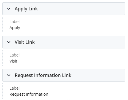
- Three default options will populate: Apply, Visit, Request Information.
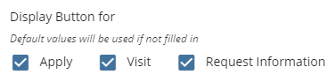
- You have the ability to override each button label and link.
Example Pages
Below is a listing of several site pages that are using the new page elements: