Galleries in the Department of Art
Scott Scribner
Photo Synthesis: Logo Design
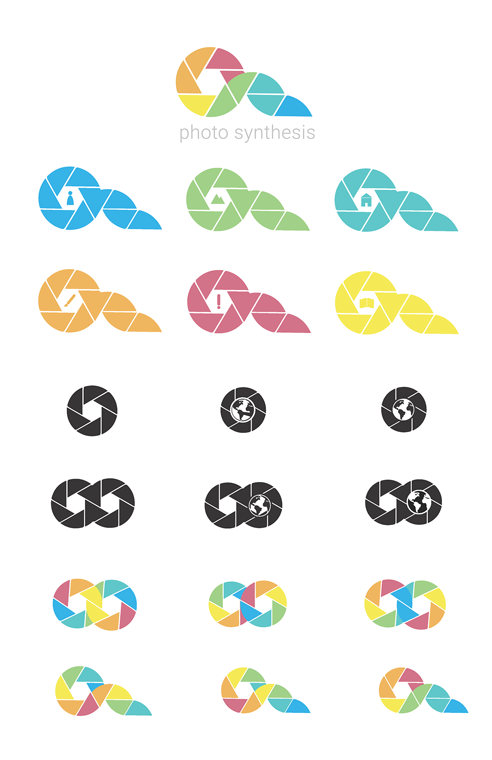
This logo was designed for a solo class project which involved the development of branding systems for a made up company. In the case for my project, I decided to create a company that revolved around instant cameras. I landed on the name Photo Synthesis as a play on words which meant the culmination of photographic ideas. To reflect this idea, the logo was based off the typical aperture design, but pushed further. Elements from an aperture icon were extended beyond the typical symbol to represent film coming off a roll. The colors were brought in to push the idea of synthesis even further. Colors one would find in nature were used, and because of these colors, the final design could also resemble a scene of waves reaching rolling green hills in front of a bold red sunset. You can see the development of this logo and its variations in the image I have attached.
Force
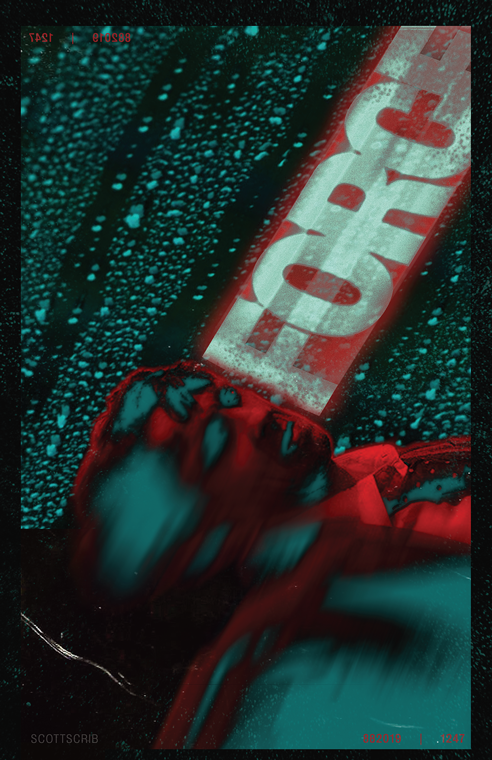
Force is a self initiated poster design that revolves around my experimentation with design software. Photoshop was used to warp, smear, repeat, and offset stock photos until the original images became almost unrecognizable from their originals. In this experiment, the word "Force" was chosen to imbue messaging into the poster. The type was warped to push the word's underlying meaning into a literal sense where the word forces itself upon the subject. The strong colors of blue and red were used to create glaring contrast within the entire image. This helped further create feelings of stress or pressure.